Let me just get this off my chest: The Xiaomi Mi Mix 3 is the coolest looking smartphone that Xiaomi currently sells, and quite possibly the best-designed smartphone on the market. While the previous generation Mi Mix 2S also has the Mi Mix line-up’s signature ceramic back and nearly bezel-less front display, the Mi Mix 3 takes everything that made the Mi Mix 2S look great and turns it up a notch (without actually having a notch). The Xiaomi Mi Mix 3 has even less bezel than the Mi Mix 2S because Xiaomi was able to trim down the bezel even further by moving the camera from the bottom to behind the display—you have to slide the display down to expose the front cameras! Although it launched in late 2018, the Mi Mix 3 embodies 1 of 3 smartphone design trends we expect to see throughout 2019. How well does the first smartphone sold internationally with a slider design fare? We find out in our Xiaomi Mi Mix 3 review.
| Device Name: | Xiaomi Mi Mix 3 | Price: | Starts at $540/€499/£499 |
|---|---|---|---|
| Android Version: | Android 9 Pie-based MIUI 10 | Display: | 6.39-inch 19.5:9 AMOLED, FHD+ (2340×1080), 600nit maximum brightness, 60000:1 contrast ratio, Gorilla Glass 5, 93.4% screen-to-body ratio |
| Chipset: | Qualcomm Snapdragon 845 | Connectivity: | USB Type-C (USB 2.0); Bluetooth 5.0; NFC; Dual SIM, Dual GPS |
| RAM: | 6GB/8GB/10GB LPDDR4X | Battery: | 3,200 mAh; Qualcomm Quick Charge 4+ support; Qi wireless charging |
| Storage: | UFS 2.1 128GB/256GB | Front Camera 1: | Sony IMX576 24MP; 1.8µm; f/2.2; HDR |
| Rear Camera 1: | Sony IMX363 12MP (wide-angle), 1.4µm, f/1.8, 4-axis OIS | Front Camera 2: | 2MP depth-sensing |
| Rear Camera 2: | Samsung S5K3M3 12MP (telephoto), 1.0µm, f/2.4, 2x optical zoom | Dimensions & Weight: | 157.9 x 74.7 x 8.5mm; 218g |
About this review: Xiaomi’s U.S. PR loaned me this device for review purposes. I have used the device for about 50 days before writing this review.
Xiaomi Mi Mix 3 Design
The Xiaomi Mi Mix 3, unlike most other smartphones, doesn’t make room for its camera sensors up top. Rather, its front-facing 24MP primary camera, 2MP depth-sensing secondary camera, and LED flash are hidden behind the display. That means when you want to use them, you have to slide the screen down. The existence of moving parts on a smartphone may worry you about the Mi Mix 3’s durability, but rest assured, Xiaomi states that the sliding mechanism is rated for 300,000 slides—a figure which most users won’t ever meet until far past the expected lifetime of the device. There’s not quite enough time in my day to put this claim to the test, but a durability test has shown the device can far exceed the rated value.


You’ll notice that the earpiece is also located behind the display, but you don’t need to slide the phone down to answer calls. There is a speaker grill on the top bezel that acts as a pass-through for answering calls.
An unfortunate side-effect of the slider is dealing with particles. My Mi Mix 3 review unit has gotten dust and lint quite frequently by the cameras. There is a tiny gap between the screen and body, which is just small enough for lint and dust. It’s not a huge deal for me, but it does mean I needed to wipe off the particles every once in a while. Over time, this does become annoying, especially the few times I did try to use the front-facing cameras.

Dust and lint in the Mi Mix 3’s slider area
The rear camera sensor placement of the Mi Mix 3 is reminiscent of the iPhone XS, but the similarities end there. There’s a fingerprint scanner towards the upper half of the back. The Xiaomi Mi Mix 3’s back is made of ceramic which gives it a nice weight and sturdiness with the added benefit of scratch resistance and durability. The Mi Mix 3 does get covered in smudges from fingers quite easily, though the included case can help with that. Xiaomi sent us the Onyx Black model, which looks like more of a gray to me. The beautiful Mix logo is emblazoned on the back in gold, which compliments the black back quite nicely.


The front of the Xiaomi Mi Mix 3 can only be described as futuristic. There are no display hole cameras or huge notch cutouts. The Mi Mix 3 has a very slim bezel that thankfully houses a notification LED and a tiny earpiece speaker grill. The bottom chin is slightly larger than the top bezel, but the side bezels are equal in size. The Xiaomi Mi Mix 3’s frame is made of a clean aluminum. Its color nearly matches that of the ceramic on the back.


The Xiaomi Mi Mix 3’s volume buttons rest above the power button on the right side. On the left, Xiaomi has placed a dedicated button for the assistant. In China, the button is mapped to Xiaomi’s AI assistant. On the global ROM, the button defaults to the Google Assistant but is remappable in MIUI to 6 other tools. In my view, Xiaomi knows how to do dedicated buttons right, unlike Samsung, who really wants you to use their Bixby assistant. The left side of the device also houses the dual SIM card tray. Unfortunately, the Xiaomi Mi Mix 3 doesn’t support microSD cards for expandable storage as some other smartphones do.
Another unfortunate design decision is the removal of the 3.5mm headphone jack on the Xiaomi Mi Mix 3, but they did include a USB Type-C to 3.5mm headphone jack adapter in the box. The bottom of the phone has a USB Type-C port surrounded by what looks like 2 speaker grilles, but only one of them actually has a speaker in it. Xiaomi, like OnePlus, placed 2 grilles on the bottom for symmetry.

The haptic feedback on the Xiaomi Mi Mix 3 isn’t too shabby. I would say this has some of the most average haptics out of the Android smartphones I’ve tested. The vibration on the Mi Mix 3 isn’t at the same level as the Google Pixel 3 or iPhone XS, but that’s a really high bar to meet.
When the phone vibrates, it isn’t too strong or weak. Xiaomi has pulled off the hard-to-come-by middle ground of haptic feedback. Speaking of which, Xiaomi has added some custom feedback for many actions. Pressing the buttons on the navigation bar triggers the haptics, as does long-pressing an item in the Quick Settings panel.
My only complaint about the design is the thickness, which makes sense since there’s an entire piece behind the display. To make the phone not comically thick, it has a smaller battery than comparable flagships. I know I am in the minority here, but I would prefer no front-facing camera rather than a slider mechanism. That’s not realistic for any company to do because of the prevalence of social media, though.
Xiaomi Mi Mix 3 Display Thoughts
The Xiaomi Mi Mix 3 has a 6.39-inch 2340×1080 (19.5:9) resolution HDR display with 403ppi. The technology is Super AMOLED, and the display panel is sourced from Samsung. The Mi Mix 3 has an impressive 93.4% screen-to-body ratio. In my view, the Xiaomi Mi Mix 3 has one of the best-looking 1080p displays I’ve ever used. It’s better than the 1080p OLED panel on the OnePlus 6.

In the display settings, the Xiaomi Mi Mix 3 has 3 contrast modes: automatic contract, increased contract, and standard. Compared to standard, automatic contrast mode changes the contrast of the device depending on the light that’s available, while increased contrast just increases the base contrast. I personally keep the device on automatic for the best experience.

Display – Living the notch-less life
Life with a notch-less smartphone is great. Watching video content on the entire screen without sacrificing any viewing space is the way to go. When watching any video on YouTube, all you need is a simple pinch of the screen and the video fills up the entire screen. The only thing you see is the video and really small bezels. The Xiaomi Mi Mix 3’s bezel-less design brings a whole new level of immersion to watching videos. Sure, zooming in may cut out some parts of a video—but trust me, it’s hard to resist doing so when the alternative is wasting all that display space that could be filled up with video.

Gaming on the Xiaomi Mi Mix 3 is also an immersive experience. While playing Fortnite Mobile on smartphones like the Huawei Mate 20 Pro, the game fills up to the notch by default so you are missing part of the action. On the Mi Mix 3, there is nothing that gets cut out. In games like Fortnite Mobile or PUBG Mobile, you’ll have a slight advantage over people on other phones like the POCO F1 or OnePlus 6 where the notch eats away part of the viewable game area.

In other multimedia use cases like web browsing, reading Twitter, viewing pictures in Google Photos, or even checking the weather, the Mi Mix 3 can display a lot more information on the screen in a body that’s about same size as competing flagships. Getting rid of the navigation bar and using the built-in fullscreen gestures will let you use almost the entire screen for whatever content you want.


Overall, moving to a device with a basically non-existent bezel is a huge improvement in content immersion. I highly recommend you give it a shot.
MIUI 10 (Android Pie) on the Xiaomi Mi Mix 3
Xiaomi sent me the Mi Mix 3 pre-installed with MIUI 10 Global Stable based on Android 9 Pie. Unlike MIUI 10 China, the global ROM has support for more languages than just English and Mandarin, and it also comes pre-installed with Google Play apps and services.

MIUI is generally not the most well-beloved software among users on our forums. Some say it’s because it looks too much like iOS while others say that it’s because it strays too far from AOSP. Even though the Mi Mix 3 is running Android 9 Pie, there hardly anything that resembles “stock” Android Pie. Evaluating MIUI 10 on the Xiaomi Mi Mix 3 on its own merit, there are things that I like and things that I don’t like, even as a heavy Samsung Experience/One UI user. The user interface does resemble parts of iOS with sprinkles of Android in it.


The Quick Settings panel slides down into a 4×3 grid. You can select the options to toggle it or click the toggle name to expand it into easy-to-access settings. Google actually removed the ability to expand the toggles in Android Pie, so it’s nice to see Xiaomi didn’t follow suit in MIUI 10.
The recent apps overview shows your apps in two columns with the apps alternating in rows. Stock Android Pie has them in a horizontally scrolling list, so seeing this new style is refreshing because the overview shows more than one app at a time. At the bottom of the overview, there’s a close all button that, oddly enough, doesn’t close the app that’s actually open if you access the recent apps overview from an app. MIUI’s clear all button doesn’t just close the opened apps but also seems to clear everything out of RAM. I connected the Samsung Gear Sport smartwatch to the Mi Mix 3 and every time I clicked clear all from recents, my Gear Sport would get disconnected.


The stock MIUI 10 launcher wasn’t for me. I tried to stick by the stock launcher for a bit until I moved over to Lawnchair Launcher. I switched because the stock MIUI 10 launcher doesn’t have an app drawer or all launcher shortcuts. The launcher also had a feed on one of the pages which kept “recommending” I install apps like TikTok. (I did end up briefly switching back to the stock launcher so I could disable these advertisements “recommended” apps because of an issue with the stock icons.)


During my time with the Xiaomi Mi Mix 3, I did run into a few issues. First of all, the Mi Mix 3 doesn’t support VoLTE or WiFi calling in the United States, or at least it doesn’t on T-Mobile. When texting through SMS, the default app just wouldn’t work with group chats. It received every message sent in its own thread. I was able to fix this by using the Messages app from Google which then wouldn’t show pop-up notifications. The third-party Textra app ended up working for me but it was a lot of work just to receive texts properly.
MIUI is also just very bloated in that there are a lot of pre-installed apps. While most of these might actually be useful apps like the voice recorder or compass, users of Google apps will find many of the pre-installed to be redundant. Xiaomi ships all their default apps and all the Google default apps which mostly serve the same purpose. There’s no need for two galleries, two web browsers, two music players, and two video apps. The stock MIUI apps aren’t as good as Google’s, so I would have liked to see less of their services on the device.
Since I have extensive knowledge of Samsung’s Android Pie-based One UI, I felt I should compare One UI with Android Pie-based MIUI 10. As I had said in my One UI review, Samsung’s Android Pie software is designed for large phones. Both my Samsung Galaxy Note 9 and the Xiaomi Mi Mix 3 review unit have 6.4-inch screens, but how Xiaomi and Samsung’s software take advantage of the display area is are completely different. One UI shifts interactable elements down while leaving the information-dense content up top for easier one one-handed use. MIUI 10 isn’t nearly as elegant in this regard.
To show off the difference in design philosophy between the two companies, let’s take a look at the Quick Settings panel on both software. Samsung places tiles at the bottom where it is easy to reach with one hand while Xiaomi places them at the top. The positioning of UI elements in Samsung’s software is more convenient for the user compared to MIUI 10.


Lastly, let’s look at the launchers. Below are two screenshots: to the left is MIUI 10 and to the right is One UI. Both of these are the stock layout of the given launcher. As you can easily see, One UI is a lot less cluttered. Samsung’s launcher puts the more interactive elements, like the search bar, at the bottom and moves the visual weather widget to the top. I often found myself shifting my hands a lot to use MIUI since I did keep it mostly stock after switching back from Lawnchair.


Overall, Samsung did a much better job at optimizing their software for the hardware than Xiaomi did. Xiaomi did announce the start of development for MIUI 11 which will hopefully fix many or all of these issues, but for now, we are stuck with MIUI 10. MIUI 10 on the Xiaomi Mi Mix 3 isn’t a bad experience—on the contrary, it’s a very fast, fluid experience—but it just isn’t what I expect from a flagship smartphone. We should be asking more from OEMs.
This being XDA, we should note that Xiaomi smartphones are easier to mod. Throwing a custom ROM on the Xiaomi Mi Mix 3 is far easier than on the Samsung Galaxy Note 9, so I was easily able to flash the Pixel Experience GSI on the Mi Mix 3 without issue, but I’m not going to delve too deeply into the custom ROM experience in this review.
Xiaomi Mi Mix 3 Camera Quality
The Xiaomi Mi Mix 3 got an impressive overall score of 103 from DxOMark, which puts it above the Google Pixel 3 in terms of rear camera performance. (The Google Pixel 3 outranks the Xiaomi Mi Mix 3 in DxOMark’s new selfie camera tests, though.) If DxoMark thinks the Mi Mix 3 can compete with the Google Pixel 3, I decided to put it against the heaviest hitters in mobile camera technology: the Google Pixel 3 XL and Huawei Mate 20 Pro. Below are a couple of tests between the three smartphones. Every picture was taken with their respective AI and HDR modes enabled and set to auto.
As with most photography, beauty is in the eye of the beholder. All of these picture comparisons are based on my own opinion, but I recommend that you make up your own mind on the pictures then compare with my opinions.


Out of these three pictures shown above, I would give it to the Huawei Mate 20 Pro. It produces the picture with the most detail in every part of the picture. The Xiaomi Mi Mix 3’s isn’t bad but doesn’t have much detail at all in the background. The Google Pixel 3 XL and Huawei Mate 20 Pro both show a lot more detail in the background. Out of the three pictures, the lighting on the Google Pixel 3 XL is arguably the worst.


The best picture of the three is from the Huawei Mate 20 Pro, with the Google Pixel 3 XL being the worst and the Xiaomi Mi Mix 3 in the middle. The Huawei Mate 20 Pro has the best dynamic range while also keeping the light equal throughout all the pictures. The Xiaomi Mi Mix 3 has the biggest flare of all the pictures.
The front-facing camera performance is very different, though.


All of these pictures were taken in the same position with the sun in the background because every device supports HDR on the front-facing cameras. Out of the three phones, the Google Pixel 3 XL has the best selfie. It keeps the most detail in the sky behind me while also having the most realistic colors. The Google Pixel 3 XL also keeps the most colors in my face while having it exposed properly. The Huawei Mate 20 Pro keeps the most details in my eyes and face while also keeping details in the background, but the colors, while pleasing, are very inaccurate. The Xiaomi Mi Mix 3 can barely handle the sky behind me; it seems as if there is no HDR at all.


Out of all of these phones, again, the Google Pixel 3 XL takes the best front portrait mode pictures. The Xiaomi Mi Mix 3 isn’t bad per-say, but again, it just doesn’t have any HDR in the portrait mode. The entire blurred part is essentially all white. The Huawei Mate 20 Pro also has this issue; its pictures are pretty much all white in the blurred part and you can’t really see the blurred background.


One of the most advertised new camera features of the Xiaomi Mi Mix 3 is its Super Night Scene feature, which has since been brought to the Mi 8 series and POCO F1. To put it to the test, I took a picture of an object in a dark room. All three pictures shown above were taken within a minute of each other in the same lighting conditions. The Mi Mix 3’s photo is very dark and grainy compared to the others. The Google Pixel 3 XL’s photo, while the brightest, doesn’t keep as much detail in the floor as the Huawei Mate 20 Pro’s photo. Thus, the Huawei Mate 20 Pro wins this comparison.
As for video, I will leave that to you to decide. Below are five different clips I recorded from the Xiaomi Mi Mix 3’s cameras. The front-facing camera, front-facing video bokeh, rear 1080p@60fps, rear 4k@60fps, and rear 4k@30fps were all tested. There are a lot of modes and each is different with stabilization and coloring.
The Xiaomi Mi Mix 3’s video recording is not as good as on the Google Pixel 3 XL or the Huawei Mate 20 Pro. The Xiaomi Mi Mix 3 is $350+ less than the Google Pixel 3 XL and almost half the price of the Huawei Mate 20 Pro, so it can be forgiven somewhat.
The Mi Mix 3 is Xiaomi’s first smartphone to capture videos at 960fps. Unlike the Samsung Galaxy S9 and Galaxy Note 9, however, Xiaomi’s super slow motion feature uses software interpolation. It takes a 1080p 240fps video then interpolates frames to turn it into a 720p 960fps video. The comparable feature on the Samsung Galaxy Note 9, which uses the DRAM on the image sensor to actually capture enough frames, is much better compared to the Mi Mix 3’s super slow motion. Samsung’s holds more details, allows for a longer video, and has better colors. The two super slow motion features don’t compare at all.
Lastly, on the software front, the Mi Mix 3’s double tap to launch camera is a bit disappointing. The setting is there if you look around enough, but when you actually use it, it’s pretty limited. It only lets you take one picture and requires you to accept the picture after taking it. A few times after taking a photo and accepting it, the picture didn’t get saved for me. I ended up just disabling the shortcut and using the app icon for launching the camera app.
Xiaomi Mi Mix 3 Performance in Benchmarks
The Xiaomi Mi Mix 3 has basically the same hardware specifications as almost every over 2018 flagship Android smartphone. It has a Qualcomm Snapdragon 845 mobile platform, 6, 8, or 10GB of LPDDR4X RAM, and 128 or 256GB of UFS 2.1 storage. Although the option for 10GB of RAM is nice (if you can even get that model), the 3,200 mAh battery is small compared to other devices like the Honor View 20 or Samsung Galaxy Note 9. The Xiaomi Mi Mix 3 does support 10W Qi wireless charging, though, and Xiaomi even graciously includes a free wireless charger in the box. That’s definitely nice.
In benchmarks, the Xiaomi Mi Mix 3 is on par with the OnePlus 6T, which is one of the fastest Android flagship smartphones on the market.
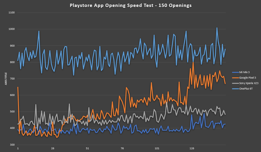
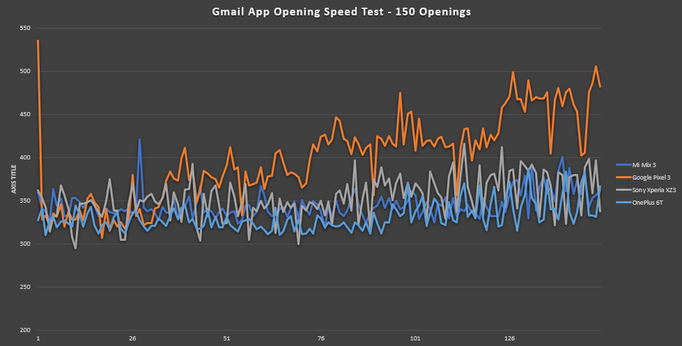
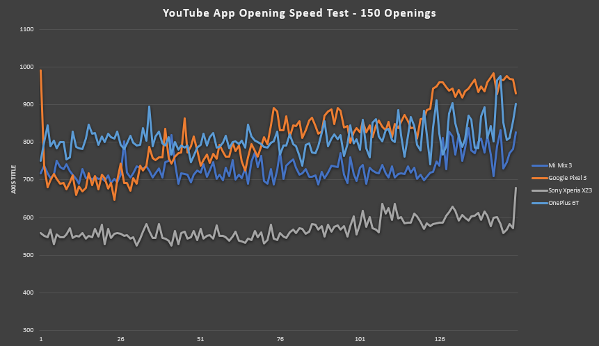

Shown above are three tables comparing the application opening speeds of three popular apps: the Google Play Store, YouTube, and Gmail. In these tables, the lower the score, the better the device performed. The Sony Xperia XZ3 surprisingly beats all the other devices, but the Mi Mix 3 beats the OnePlus 6T and Google Pixel 3. Besides YouTube, the OnePlus 6T and Xiaomi Mi Mix 3 are about equal in app opening speeds, but the Mi Mix 3 barely pushes ahead. The Mi Mix 3 opens the Google Play Store the fastest reliably while the Pixel 3 does at first. The Gmail app is opened at about the same speed on the Sony Xperia XZ3, Mi Mix 3, and OnePlus 6T. The Pixel 3 is much slower throughout the testing.

The next benchmark we ran was to test data transfer speeds. There were three sets of files we tested, 1,000 1MB files, one 1GB file, and one 100MB file. The Snapdragon Samsung Galaxy Note 9, Google Pixel 3, and Huawei Mate 20 Pro support USB 3.1 while the Xiaomi Mi Mix 3 and OnePlus 6T support USB 2.0. The Google Pixel 3 destroys the transfer speed test while the Xiaomi Mi Mix 3 and OnePlus 6T are about equal.
I personally tested the Xiaomi Mi Mix 3, Snapdragon Samsung Galaxy Note 9, and Huawei Mate 20 Pro while Daniel Marchena tested the OnePlus 6T and Google Pixel 3. The Google Pixel 3 should be close to the same speed as the Huawei Mate 20 Pro and Samsung Galaxy Note 9, but those two are slower. The reason is most likely because of my PC even though my PC does support USB 3.1 Type C and the files were transferred off an SSD.
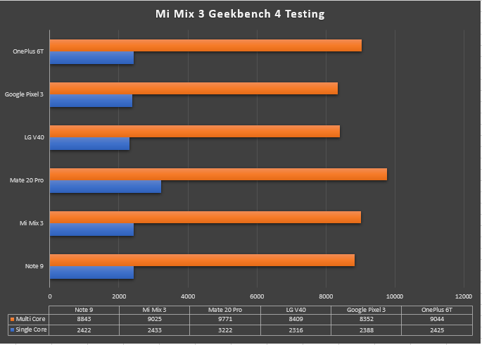
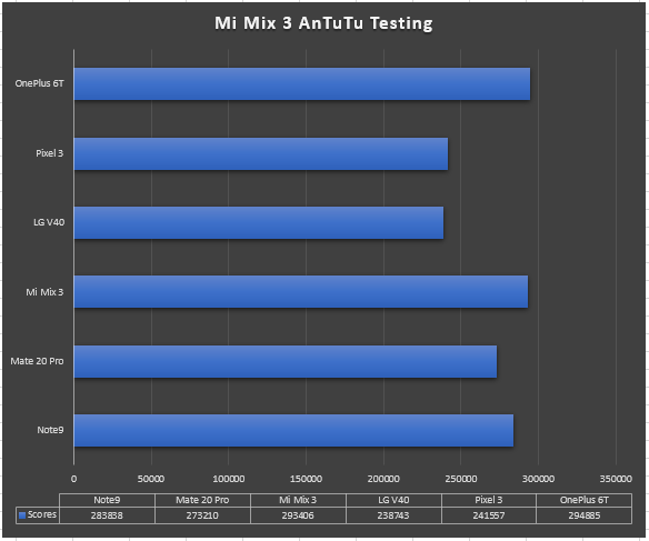
We don’t place much emphasis on synthetic benchmarks, but people still love them and so we here they are. In Geekbench 4, the Huawei Mate 20 Pro wins the test in multi-core and single core scores. Coming in 2nd by a slim margin is the OnePlus 6T in multi-core while the single core it is ranked 3rd. The Xiaomi Mi Mix 3 came in 3rd for multi-core and 2nd for single core. The other devices are all about the same.
In AnTuTu, the scores present a slightly different story. The OnePlus 6T wins again by a very slim margin while the Xiaomi Mi Mix 3 comes in 2nd. The Samsung Galaxy Note 9 comes in 3rd place which is surprising. The Huawei Mate 20 Pro is lower than I expected. The Google Pixel 3 and LG V40 ThinQ are both lower than the other devices but not by a lot.
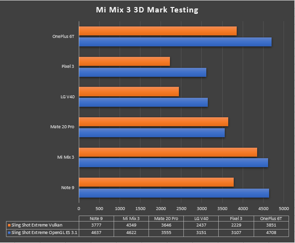
In the 3DMark benchmarks, we get a way better sense of the GPU power on the given devices. The OnePlus 6T again wins but this time only in the OpenGL benchmark. The all-around winner of this benchmark is the Xiaomi Mi Mix 3. It performs the best in both Vulkan and OpenGL.
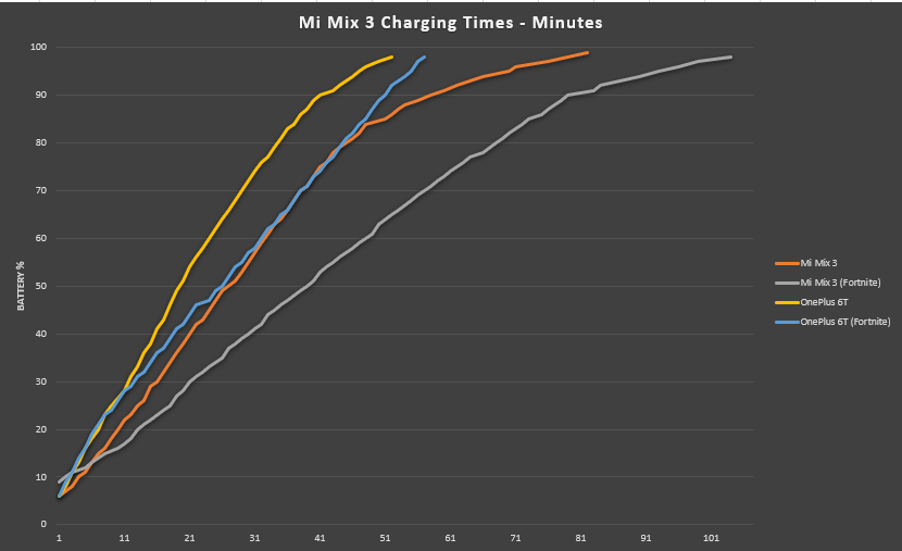
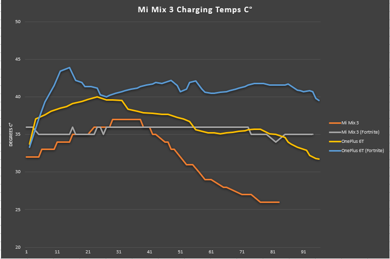
In the charging speed tests, the Mi Mix 3 isn’t that special. Although it’s rated for Qualcomm Quick Charge 4+, the charger that comes with the device is apparently only a Quick Charge 3.0 charger. In the test, while the Mi Mix 3 isn’t as fast at charging as the OnePlus 6T, it stays much cooler than the OnePlus 6T while playing Fortnite.
Xiaomi Mi Mix 3 Battery Life
In my experience, the battery life on the Xiaomi Mi Mix 3 isn’t great. I am not able to make it through a day of fairly heavy social media, music streaming, and video watching use. My heavy usage consists of streaming Spotify while connected to Bluetooth headphones, browsing Reddit, Twitter, and Instagram, and watching Netflix. None of those apps are particularly heavy, but I’ve had better battery life on other smartphones. If the device can’t last over 4 hours doing this, it is not a good flagship level battery life.
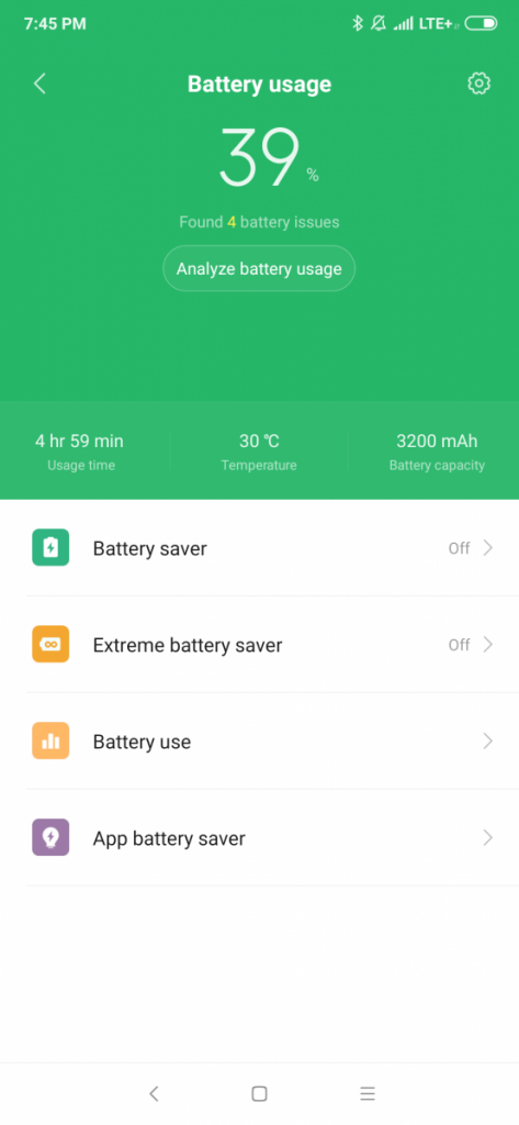

The screenshots shown above represent my average battery life for a single day of usage. I get about 2 hours of screen on time from 60% of the battery. At this rate, I get at most 3.5 hours of usage on a single charge. This is about what I got on the Samsung Galaxy S6 edge… in 2015. In 3 or 4 years, battery life should have gotten much better and it has, but not on the Mi Mix 3. The battery life on the Mi Mix 3 with my very heavy usage of social media and messaging apps just didn’t work out well.
Conclusion
The Xiaomi Mi Mix 3 isn’t my favorite phone of all time, but it’s far from my least favorite. The build quality is superb, the screen is immersive, and the rear camera performance is great by even DxOMark’s high standards. The MIUI software isn’t a clean experience and the battery life definitely needs some optimization, though.
Would I still recommend the Xiaomi Mi Mix 3 over the OnePlus 6 or OnePlus 6T? Yes, I would. For a very similar price, you get a smartphone that is just as fast, has a better display, better cameras, better build quality, and wireless charging to boot. It’s a better device for a comparable price, and I recommend you give it your consideration.
However, keep in mind that Xiaomi may launch a new model of the Mi Mix 3 with the Qualcomm Snapdragon 855 mobile platform and 5G support. If you want the same package with a much improved SoC, keep an eye out for the upgraded model. Though, it’ll likely cost significantly more than the existing model.
Xiaomi Mi Mix 3 Forums and Where To Buy
If you’re at all interested in the Mi Mix 3, we recommend you check out the dedicated forums for the device we have on XDA. Here you’ll find fellow and prospective owners to discuss the latest software news, share apps, tips, guides, tricks, accessories, and, most importantly, custom ROMs/kernels/mods.
If, after reading this review, you want to purchase the device, you can do so directly from Xiaomi’s Mi.com website or retail stores if you live in the UK, Spain, France, or Italy. The device appears to be available in the United States on Amazon. If you live in other countries, you’ll have to check with your local online retailers.
[UK] Buy the Xiaomi Mi Mix 3 from Mi.com
[Spain] Buy the Xiaomi Mi Mix 3 from Mi.com
[France] Buy the Xiaomi Mi Mix 3 from Mi.com
[Italy] Buy the Xiaomi Mi Mix 3 from Mi.com
[U.S.] Buy the Xiaomi Mi Mix 3 from Amazon
[Germany] Buy the Xiaomi Mi Mix 3 from Amazon
Refference - xdadevelopers.com

0 Comments