Tab hoarders and people with fat fingers, rejoice. Google Chrome’s tab page could get a whole lot less cluttered thanks to the introduction of a new Chrome flag. The flag, only available in a freshly built Chromium APK at the time of publication, “allows users to see their tabs in a grid layout in the tab switcher.” The flag can be accessed at chrome://flags#enable-tab-grid-layout on Android devices. Here’s what Chrome’s tab page looks like with and without the flag enabled.

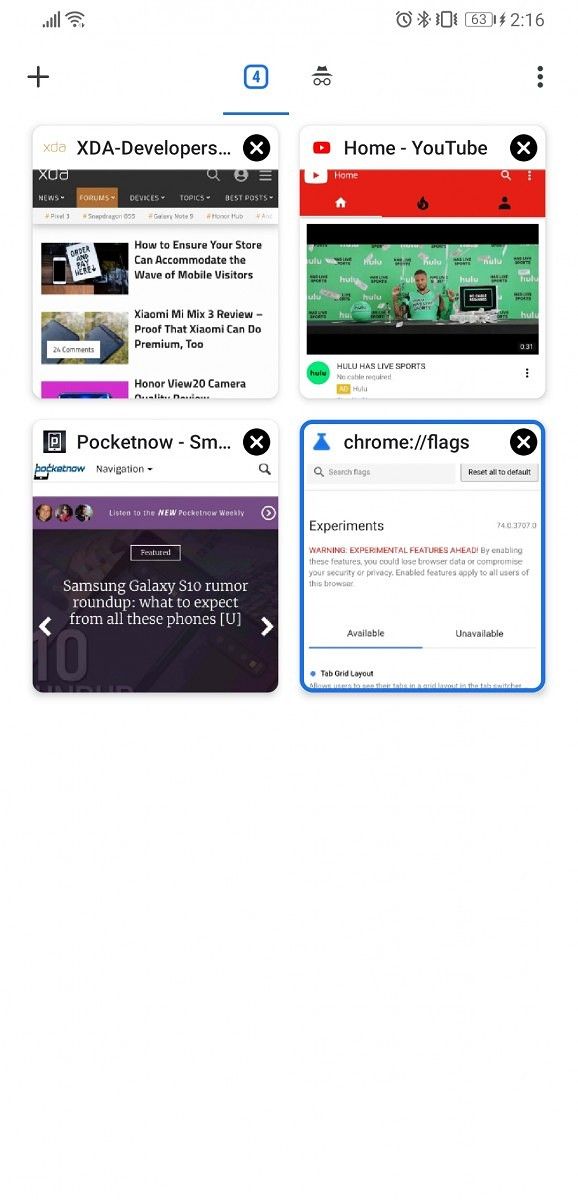
As you can see, the vertical tab layout is changed to a grid of miniature cards of equal sizes. This not only allows for far more tabs to be shown on the tab page but also makes it harder to switch to the wrong tab. This change reminds me of switching from Android Oreo‘s vertically stacked recent apps overview to the hidden grid recents in AOSP.
The new flag will soon be made available in the Chrome Canary and Dev channels. There’s no guarantee that Google won’t simply remove this flag in a future build, but I’m going to keep this enabled for as long as it’s available.
Chrome Canary (Unstable) (Free, Google Play) →
Chrome Dev (Free, Google Play) →
In other news, Google is also testing a new “Scroll-To-Text” feature for all OS versions. According to the explainer document, the Scroll-To-Text feature will “enable users to easily navigate to specific content in a web page.” Certain web pages that use “named anchors and elements with ids” already allow you to scroll directly to parts of a web page, but not all pages take advantage of this. This would be especially useful for mobile users, as the document states that less than 1% of Chrome for Android users use the “find in page” feature.
We’ll keep you updated on the progress of the grid tab layout and the new Scroll-To-Text feature as they roll out to more users.
Refference - xdadevelopers.com


0 Comments